


In this regular column, Club Vita’s longevity experts will help you visualize the often abstract world of longevity risk by introducing their own personal favorite charts.
In the edition Club Vita's UK Membership Secretary, Steve Hood, shows a chart that illustrates why it is important to capture and use all available information when setting longevity assumptions for pension plans.

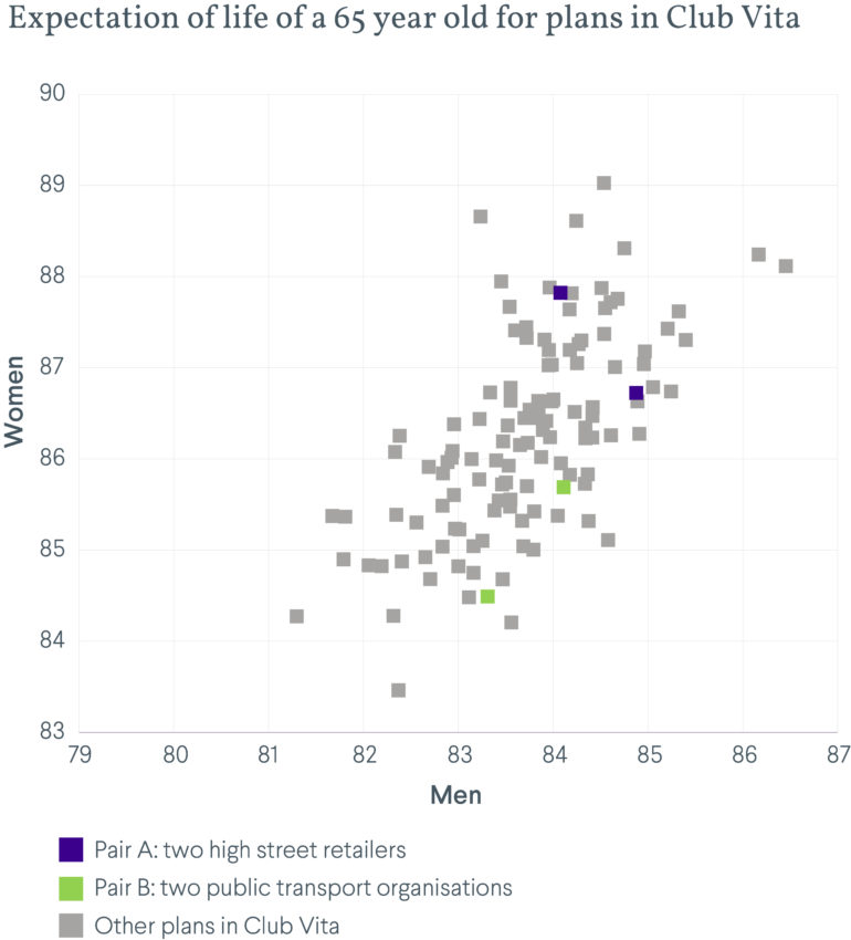
The Bee-swarm chart - Illustrating diversity
Question:
How diverse can longevity between pension plans really be?
Answer:
Very diverse. What’s more this diversity is not easily predicted by considering any single factor (e.g. industry) in isolation. However, consideration of the characteristics of individual plan participants, such as their lifestyle and affluence, can allow the diversity of longevity to be recognized and understood.
The chart below has been evolving since Club Vita was launched; it simply shows the longevity experience observed by plabs that pass their data to Club Vita. The chart illustrates a powerful message – there is no such thing as an ‘average’ pension plan in longevity terms and, as a result, generic longevity tables (designed to apply to many plans) are simply not fit for purpose.
Key Takeaways
It is risky to make broad assumptions about the longevity of a pension plan’s membership based only on high level information about the organization, such as the industry sector or geography.
There is a good distribution of results with no obvious grouping or clustering of plans, indicating that each plan has a unique longevity fingerprint. The strong diagonal shape of the data points suggest that male and female longevity are affected by similar factors
Generally, as you move from bottom left to top right we find that plan participants become more affluent and have healthier lifestyles. However, it isn’t always simple to predict a plan’s position without detailed analysis. The pairs in the chart show plans that would appear to be very similar in nature, showing that taking things at face value could easily lead to longevity being mis-estimated.