


Exponential growth
One thing that I am learning through the COVID-19 pandemic is that exponential growth is a difficult phenomenon to describe.
Growth: when something increases in size over time. Exponential growth: when the rate of increase itself increases in line with the underlying size. Before social-distancing policies were put in place, each person with the COVID-19 virus was likely to pass it on to multiple other people. This meant that the number of cases of the disease in a given area could grow exponentially, starting with a small number and increasing rapidly over a short period

What’s the biggest city in Ireland?1
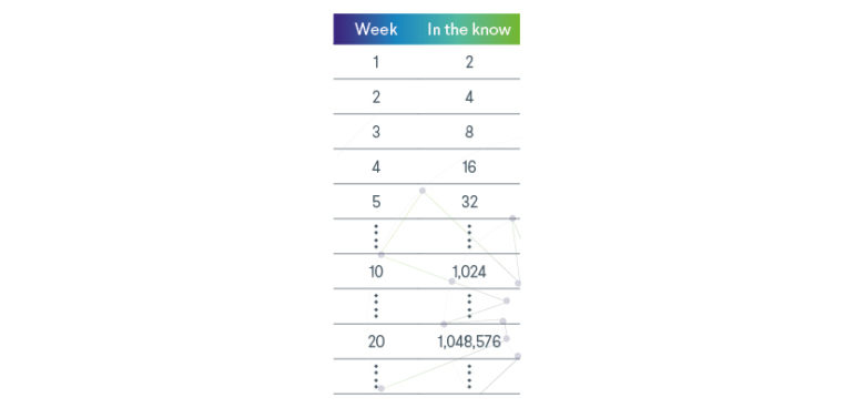
Using a different example to picture this, suppose one person knows a secret. After one week they tell someone else. The following week, both tell one more person. The following week all four tell one more person each, and so on. What started off as a small group of people will in fact reach the thousands after 10 weeks and will clear a million after 20 weeks. This is exponential growth.
Enter the logarithm
As size increases so rapidly, it is very difficult to describe. If you use a scale that makes sense at the beginning, the later numbers become too big to deal with. If you use a scale that makes sense after some time, there is so little distinction between numbers at the beginning that they all look the same.
No worries – logarithmic scale to the rescue! The logarithm is one of my favorite mathematical functions, it is the inverse of an exponential and is perfect for picturing phenomenon following exponential growth. Instead of using a scale increasing in regular intervals, we can use a logarithmic scale that increases multiplicatively in magnitude2:
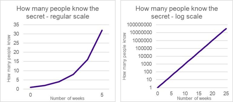
The two charts both map exponential growth. I have included iterations 1-5 on the first chart using a scale that shows this part of the growth well. If I was to plot 26 weeks on the same scale, the numbers would increase so much that the chart would actually need to reach the edge of the earth’s atmosphere.3 On the right I have used a log (based 10) scale. No trouble at all plotting 26 weeks there. This is the type of chart that has become so familiar to us when showing the increasing number of COVID-19 cases in various locations around the world.
A word of warning though: If people don’t spot the scale they may vastly underestimate the speed of growth being described by the chart. Always check the scaling approach.
Everyone has their limits
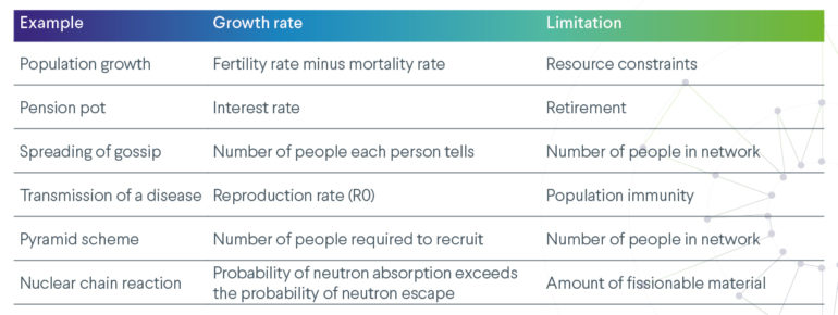
Whatever the phenomenon, it is rare that exponential growth continues forever. There is usually some natural limitation that prevents the growth from continuing indefinitely. Here are some examples and possible reasons for the growth to slow:
Some maths
Let a be some positive number. We define the exponential of base a and the logarithm of base a as:
exp(X)=aX and log(aX)=X
By definition the logarithm is the inverse of the exponential, i.e., log(exp(X)) = exp(log(X))= X
The really powerful property of these functions is that they can be used to switch between an additive group action and a multiplicative group action. Namely
log (X * Y) = log (X) + log (Y) and exp (X+Y) = exp(X) * exp(Y)
It is this property that makes the logarithm so good for plotting exponential growth. Exponential growth acts to multiply the value again and again resulting in numbers too large to plot. Transforming with a logarithm changes this multiplication into addition and changes exponential growth into linear growth – which is much easier to picture.
You can even extend this concept to power series functions called formal group exponentials and formal group logarithms which can be used to switch between other formal group structures. This can have some interesting applications, for example in algebraic number theory.4
What do you think?
Does the ability to describe the beginning and later periods of exponential growth on the same chart outweigh the danger that people will misinterpret the numbers if they miss the logarithmic scale?
1 Dublin – it keeps on dublin’ and dublin’
2 or use the same scale and plot the logarithm of the function instead (hence the name)
3 Assuming the atmosphere ends at around 100km up and that the scale on the left is 5 people per cm.
4https://academic.oup.com/imrn/article-abstract/2016/11/3205/2451520?redirectedFrom=fulltext