


The COVID-19 pandemic has hit the US particularly hard, with over 170,000 recorded COVID-related deaths at the time of writing. However, the experience has not been uniform; here we analyze the latest data to see how different parts of the country have experienced the pandemic.
The CDC has come a long way on reporting up to date death data in the US since the start of the pandemic. At the time of writing (August 21, 2020) data for almost all states seem reasonable up to the end of June 2020, there are many states where the data seems reasonable up to the end of July 2020 and some with data up to August 8. We will present charts for each state up to where the data seems reasonable.


Current position of the US
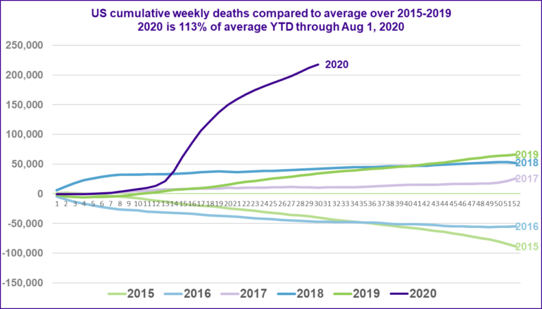
The chart below shows the cumulative weekly deaths in the US for each year from 2015, relative to the average over 2015 to 2019. Note that the aging US population means we would expect the number of deaths to increase slightly each year, all else being equal.
The purple line shows the situation up to the end of August 1, 2020. Despite official estimates of 170,000 COVID-related deaths at August 21, we are seeing around 220,000 deaths in excess of the five-year average of deaths occurring in the year by August 1 – and even this estimate is likely to be on the low side, as there are some large states that have not yet reported data for July. The period up to August 1 experienced at least 113% of the expected deaths at this point of the year (based on a five-year average).
It’s safe to say we are experiencing an extreme mortality event.
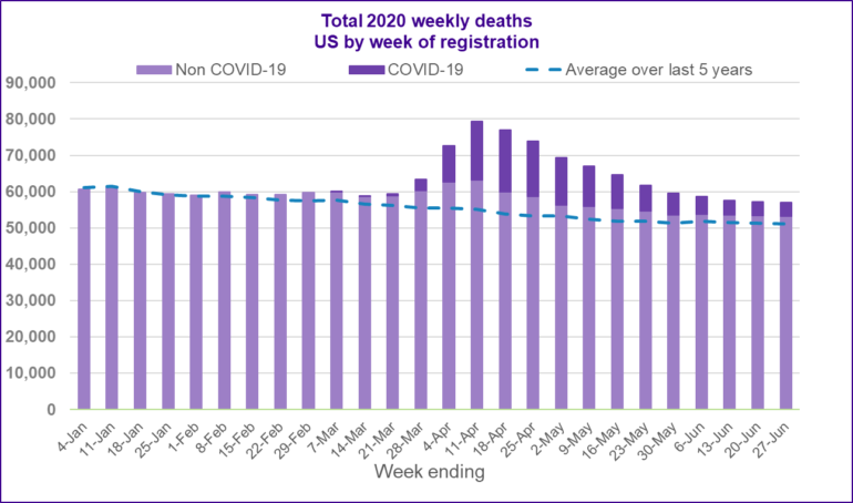
The next chart shows the number of deaths that registered in the US each week in 2020. The dark purple bars show deaths recorded as COVID related, the light purple bars show other deaths. The blue dashed line shows the average number of deaths for each week of the year based on the previous five years.
The chart shows more deaths being recorded than the previous average from the end of February. There is a distinct (and high) peak to these ‘excess deaths’ in April. Despite tailing off to a certain extent, there still remains a persistent and significant amount of excess deaths in the latest data.
Another thing we see is that many of these ‘excess deaths’ were not recorded as COVID-related. It seems likely that some of these excess deaths were in fact due to COVID and were not recorded as such. In understanding the true impact of the pandemic on the US, data on excess deaths will give us a more complete picture than deaths recorded as COVID-related.
For details of how each state, New York City, District of Columbia and Puerto Rico have been affected differently by COVID-19, including a description of how things have progressed through the country over time, please see our full article..
In this article we will use similar charts to explore how the pandemic has spread across the US and how different states have been affected differently depending on when outbreaks first occurred.
VitaMins: How different American states have experienced COVID-19 so far
Download the full article.