


This is an update from our December 15, 2020 VitaMins that analyzed state-level excess mortality data at that time. Since then, the COVID-19 pandemic has increased the number of COVID-related deaths in the US from over 290,000 to the staggering figure of over 600,000 at the time of writing.


The CDC has come a long way on reporting up to date death data in the US since the start of the pandemic. At the time of writing (June 23, 2021) data for almost all states seem reasonable up to the end of January 2021 and for most states the data seems reasonable up to the end of April 2021. We present charts for each state through the end of April in the appendix. You will be able to spot the states with reporting delays.
Current position of the US
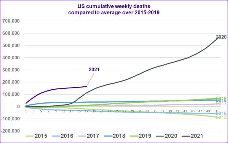
The chart below shows the cumulative weekly deaths in the US for each year from 2015, relative to the average over 2015 to 2019. Note that the aging US population means we would expect the number of deaths to increase slightly each year, all else being equal.
The grey line shows the 2020 experience compared to the previous 5-year average, the total number of deaths in 2020 was over 120% of the average for the previous 5-years. The purple line shows the 2021 experience up to the end of April.
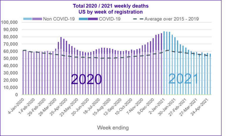
The next chart shows the number of deaths that registered in the US each week in 2020 and until the end of April in 2021. The dark bars show deaths recorded as COVID related, the light bars show other deaths. The dotted line shows the average number of deaths for each week of the year based on the previous five years.
The chart shows more deaths being recorded than the previous average from the end of February 2020 until the end of March 2021. There are three distinct waves of these ‘excess deaths’ and each affected different parts of the country to varying extents. The first wave, peaking in April 2020 was felt the hardest in New York and its surrounding areas and other metropolitan hubs like Boston. The second wave, peaking in August 2020 was most harshly felt in the southern ‘sunshine belt’ states. The third wave, peaking in January 2021 was felt right across the US, with only Hawaii not seeing significant COVID-19 deaths in this period.
In this article we will use similar charts to explore how the pandemic has spread across the US and how different states have been affected differently depending on when outbreaks first occurred.
For details of how each state, New York City, District of Columbia and Puerto Rico have been affected differently by COVID-19, including a description of how things have progressed through the country over time, please see our full article.
The source for all the data used in this article is the Weekly Counts of Deaths by State published on June 23 2021 by the Center of Disease Control and Prevention (CDC).
Charts for all states, New York City, District of Columbia and Puerto Rico can be found in the appendix.
What’s next?
Following a highly effective vaccination rollout, the total number of weekly deaths is finally coming down to within pre-pandemic expected levels. We hope the number of excess deaths remains low and that this is the final of these bulletins that we need to prepare. However, we are not at the finish line yet. We are not yet at the magical 70% vaccination rate and there is the threat of more virulent mutations of the virus in circulation.
How different states have experienced COVID-19 so far
Full state by state analysis of excess mortality (data available as at June 23 2021)