


In this regular column, Club Vita's longevity experts will help you visualize the often abstract world of longevity risk by introducing their own personal favorite charts.
In this edition of Top Charts US, Erik Pickett presents a chart exploring the mortality gap between rich and poor.

Question:
Is the mortality gap between rich and poor increasing?
Answer:
The short answer is yes.
The chart below shows how the age standardized rate of mortality has changed over time. The purple line shows the mortality rates for the 15% of US counties with the lowest median income; the green line, the 15% with the highest.
As expected, the higher income counties have lower mortality rates, and will therefore have higher life expectancies. The striking thing we see in this chart is that the difference in mortality rates (and therefore life expectancy) between these two groups has been increasing. We can see that the gap between the two lines has been widening steadily since 1999. In fact, the difference in life expectancy between the higher and lower income counties has increased over 40% between 1997 and 2017.
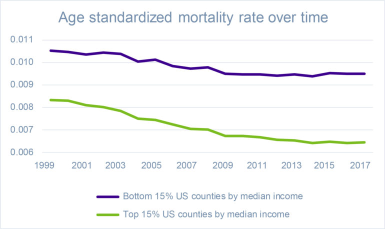
[Source: Society of Actuaries U.S. Population Mortality Observations, 2019]
Key observations
- Higher income counties have lower mortality rates and therefore higher life expectancies.
- The higher income counties continue to see recent improvements in longevity, whereas improvements seem to have stalled for the lower income counties.
- The gap between rich and poor seems to be increasing.
For longevity to improve, mortality rates need to fall. It has been well reported that longevity improvements have stalled recently in the US. However, here we see that the green line continues to decrease (although at a slower rate in recent years), showing that higher income counties are still seeing some longevity improvements. It is the lower income counties that are suffering the most notable stall in longevity improvements.
The key questions are:
- Will these differences in trend continue?
- How should we capture these differences in our baseline tables and improvement scales?
What do you think?
Please post your questions in our Friends of Club Vita discussion group on LinkedIn.