


This is an update of our analysis of state-level excess mortality data up to the end of 2021 (data available as at March 7, 2022). COVID-19 continued to contribute to significant excess mortality through 2021, with the number of COVID-19 deaths in the US now over 950,000.


The CDC has come a long way on reporting up to date death data in the US since the start of the pandemic. At the time of writing (March 7, 2022) data for almost all states seem reasonable up to the end of 2021. We present charts for each state through the end of 2021 in the appendix. You will be able to spot the few states still with reporting delays.
Current position of the US
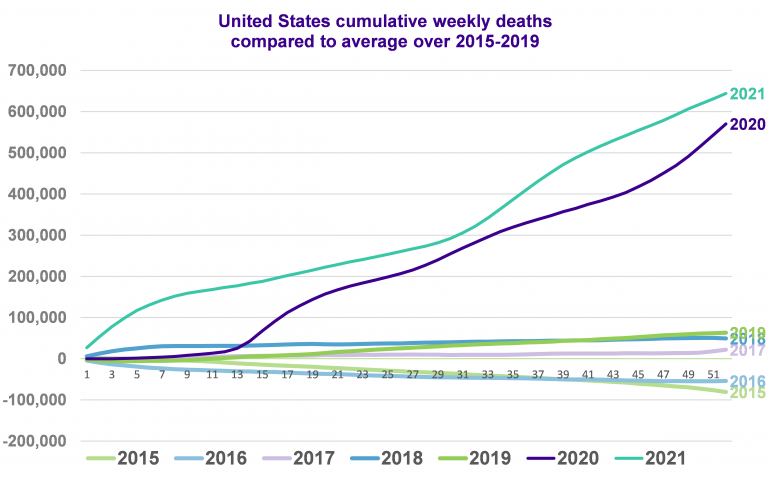
The chart below shows the cumulative weekly deaths in the US for each year from 2015, relative to the average over 2015 to 2019. Note that the aging US population means we would expect the number of deaths to increase slightly each year, all else being equal.
The purple line shows the 2020 experience, the turquoise line shows the 2021 experience, both compared to the 2015-2019 average. In both 2020 and 2021, the total number of deaths is over 120% of the 2015-2019 average. Allowing for the upward trend in expected deaths due to the aging population, we still saw around 115% of expected mortality in both 2020 and 2021 (slightly higher in 2021 than 2020). It is disappointing that, even with the roll out of vaccinations, 2021 saw more excess mortality than 2020 in the US.
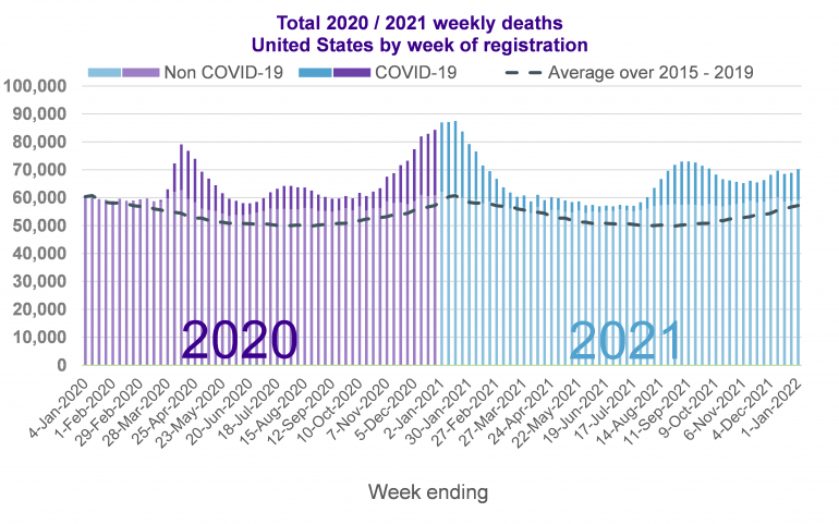
The next chart shows the number of deaths registered in the US each week in 2020 and 2021. The dark bars show deaths recorded as COVID related, the light bars show other deaths. The dotted line shows the average number of deaths for each week of the year based on the previous five years.
The chart shows more deaths being recorded than the previous average from the end of February 2020 until the end of 2021. There are five distinct waves of these ‘excess deaths’ and each affected different parts of the country to varying extents. The first wave during spring 2020, was felt the hardest in New York, its surrounding areas and other metropolitan hubs like Boston. The second wave during summer 2020, was most harshly felt in the southern ‘sunshine belt’ states. The third wave in winter 2020/21, was felt right across the US, with only Hawaii not seeing significant COVID-19 deaths in this period. The fourth wave in fall 2021 coinciding with the spread of the delta variant, was felt the hardest in the southern states. The fifth wave in winter 2021 coinciding with the spread of the omicron variant, affected many states across the US, with a particularly notable effect in the Midwest.
In this article we will use similar charts to explore how the pandemic has spread across the US and how different states have been affected differently depending on when outbreaks first occurred.
For details of how each US state, New York City, District of Columbia and Puerto Rico have been affected differently by COVID-19, including a description of how things have progressed through the country over time, please see our full article.
The source for all the data used in this article is the Weekly Counts of Deaths by State published on March 2 2022 by the Center of Disease Control and Prevention (CDC).
Charts for all states, New York City, District of Columbia and Puerto Rico can be found in the full article.
What’s next?
Despite the widespread rollout of vaccinations in early 2021, we continued to see significant waves of high mortality due to COVID-19. Although in early 2022, we are now seeing case and death numbers reducing, they are not (yet) fully disappearing. It seems our relationship with COVID-19 is now moving from pandemic to endemic. Monitoring the emerging experience is as important as ever for understanding future impacts on longevity.
Download full article
See details of how each US state, New York City, District of Columbia and Puerto Rico have been affected differently by COVID-19, including a description of how things have progressed through the country over time